Zoárd's been a little quiet on the blog but that doesn't mean he hasn't been busy doing what he does best—making prints, paintings, posters, and zines (check out his work here)! He was recently part of a local zine, art, and comics festival, and we thought this would be the perfect opportunity to tell us more about the world of zines and feature some other talented artists. Read on for Zoárd's recap of the event ...
 (image: bought and traded at the New Zineland Zine Fest)
Last week I had the pleasure of slingin’ zines and trading printer advice with fellow artists and local publishers and freaks at the New Zineland, a zine and independent publisher’s fair, over in the theater of the Central Square YMCA. This party was thrown by local community organizers, Seek and Find, bringing together scores of comic book artists, activist publications, self- published literature and poetry, art books, photography books, handmade books, and more. Seek and Find, run by Caitlin, organizes two main semi-regular events including the JP Flea Market and now New Zineland Zine Fest.
Zines in some form have existed for hundreds of years, technically speaking! By the time the Heidelberg “high speed printing machine” letterpress machines (which we utilize here at Smudge Ink) were gaining popularity in the 1930s, there were already many ways to get your message out to the public. However, the speed with these machines could help you propagate information (or unpopular opinions) was at an all-time high! The internet was beginning taking shape ... sort of.
The zine as we know it was brought to fruition with the serendipitous timing of advances in printing technology and the rise of punk rock and hardcore music culture of the ‘70s and ‘80s. Homemade, hand stapled and folded fanzines ranging topics from music scene coverage, record reviews, social theory, travel journals, cookbooks, and of course comics were shaping how these counter-cultures communicated internally but also globally. Thirty plus years out, zine’s today can be an expression of just about anything. There are no rules so long as you Do It Yourself.
 (image: Jimmy of Wing Club Press)
This year’s zinefest had a little bit of everything but I was particularly drawn to the all the Risograph Digital Duplicator representation in the house! Jimmy of Wing Club Press had some amazing new prints hot off the presses. Wing Club is a risograph and silkscreen studio out of Portland, ME. He also told me all about the upcoming New England Art Book Fair which will bring together over 45 vendors from across the NE.
Risograph prints are created by Risograph machines which are fully automated, high-speed printing machines similar to a Xerox. What printmakers and book dorks love about the Riso is the quality of the prints it produces; there’s something spellbinding about how the machine throws down its individual layers of color ink. The final result looks a lot like if a serigraph print (or silkscreen print) and a photocopy made a beautiful child. It’s a pretty amazing tool to make some really pretty zines, and Jimmy has a couple named Smudge and Smudge 2, wouldentchaknowit.
 (image: Mikey of Garbage Press demos Risograph)
I also met Mikey from Garbage Press based out of Connecticut. He self publishes rad comics and books and prints. He also lugged his TR1510 Risograph over to give us a printing demo. In this image he has the machine opened up and pulled out the printing drum on which is a screen (seen in blue) which is used to print on part of a two-color image.
 (image: Sophie Page and Jia Sung of Plum Illustration)
I was also drawn to the art zines at Sophie Page and Jia Sung’s table. Together as Plum Illustration they drove out from New York to hang out. Their zines are of really awesome illustrations of poetry and stories that inspired them. I was impressed by their very imaginative and poignant work!
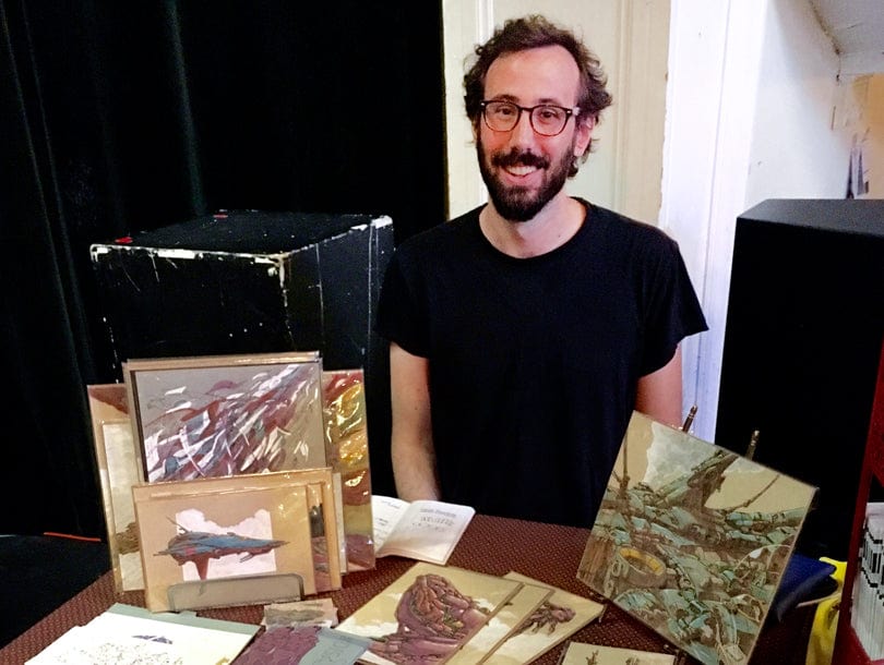 (image: Jerel Dye)
Jerel Dye had some really cool comics but also some amazing original work that were part abstraction and part sci-fi landscape studies. Also, he’s a super nice dude.
 (image: me!)
I was tabling this event as well. I recently finished up a new silkscreen book and photocopy zine entitled Cold Shape and Hideg Alak, respectively. I explore themes similar to previous books and printing projects of mine like communication and our common ancestry and how our histories are reinterpreted. I like to put zines out in pairs, one’s title being the Hungarian translation of the other. By doing that I feel I make a direct connection to my own ancestry by using a simple form of communication. I think books are an amazing vehicle to show your art. There is something very intimate about viewing art that you are holding in your hands, and it is a surprisingly different experience then the walking into an all-too-often-stuffy gallery with white walls telling you to “do not touch.”
All in all, the zine fair was a great success. I made a couple bucks, sure, but these events are all about meeting the artists and talking to them about their work. I took home a great haul of zines, postcards, prints, stickers etc. Next up, I’ll be tabling at the Northampton Print & Book Fair on October 2nd which is part of a larger city-wide printmaking festival called Print Works 2016 including Big Ink and Print Fair North hosted by Zea Mays Printmaking. It should be a pretty amazing day! See you guys there.
Read more


 Among the offerings we had the usual suspects, some more exotic offerings as well as blue, flax sprinkled mystery chip randomly chosen from the snack aisle at Target. After much (blind) snacking and deliberating we each cast three votes for our favorites.
 Here are the results: La Niña was the winner which maybe shouldn't be a surprise, considering that it's the most authentic tortilla chip and complimented the guacamole perfectly! But then Tostitos Hint of Lime and Garden of Eatin' Red Hot Blues were the other favorites, proving that we love flavor and spice!
  (image: bought and traded at the New Zineland Zine Fest)
 (image: Jimmy of Wing Club Press)
 (image: Mikey of Garbage Press
  (image: Sophie Page and Jia Sung of Plum Illustration)
 (image: Jerel Dye)
 (image: me!)


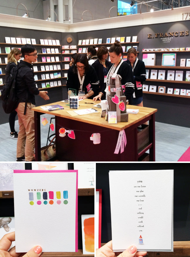
 P.S. to Emily and Margaret, you will be happy to know that I have been taking care of good 'ole Cookie (vandercook printer) while you gals have been out of the print room.
 To my excitement (and humbling surprise), I was given free rein to design a creative art installation for our trade show booth. The initial idea was to adapt one of our floral note card designs into a 3-dimensional piece made entirely out of paper. In the end I needed to build three pieces: one would go on the front of our counter and the other two would be mounted on the short wall extensions (called returns in trade show booth speak). I borrowed inspiration and know-how from Anthropology windows, restaurant signage, and Deb's to-scale architectural renderings. For the end concept, I envisioned multiple layers of floral and botanical shapes within shadow-box-like frames.

 Finally, we began to assemble the cut-out floral and botanical shapes within the frame. I had outlines of the composition printed to-scale on large sheets of paper to serve as our “map.” I laid this down and temporarily placed the shapes in their respective places on top. Sabrina may add that this led to many head scratching moments as she tried to follow this map that apparently only made sense to me. With everything in place, I removed the map, channeling the magician who rips a table cloth from underneath a table setting albeit a bit more gently. I then peeled off the stencil paper we had temporarily adhered with the aforementioned miracle Easy-Tack.
 And AT LAST, we were able to permanently glue all of the spacers and their adjoining shapes to the installation frame and their neighboring layers. To make sure nothing would come apart during transport, we boarded and shrink wrapped each of the frames and then shrink wrapped them again for extra measure. April, Eric, and Deb did an awesome job setting them up in the booth. I joined them later in the show, and I must say everything came together looking pretty darn spiffy. Had I known this would take a solid month and a half of work and leave us with temporarily arthritis-ized—again I realize not a word—hands? Nope. Would I ever take on another paper installation project? Absolutely.
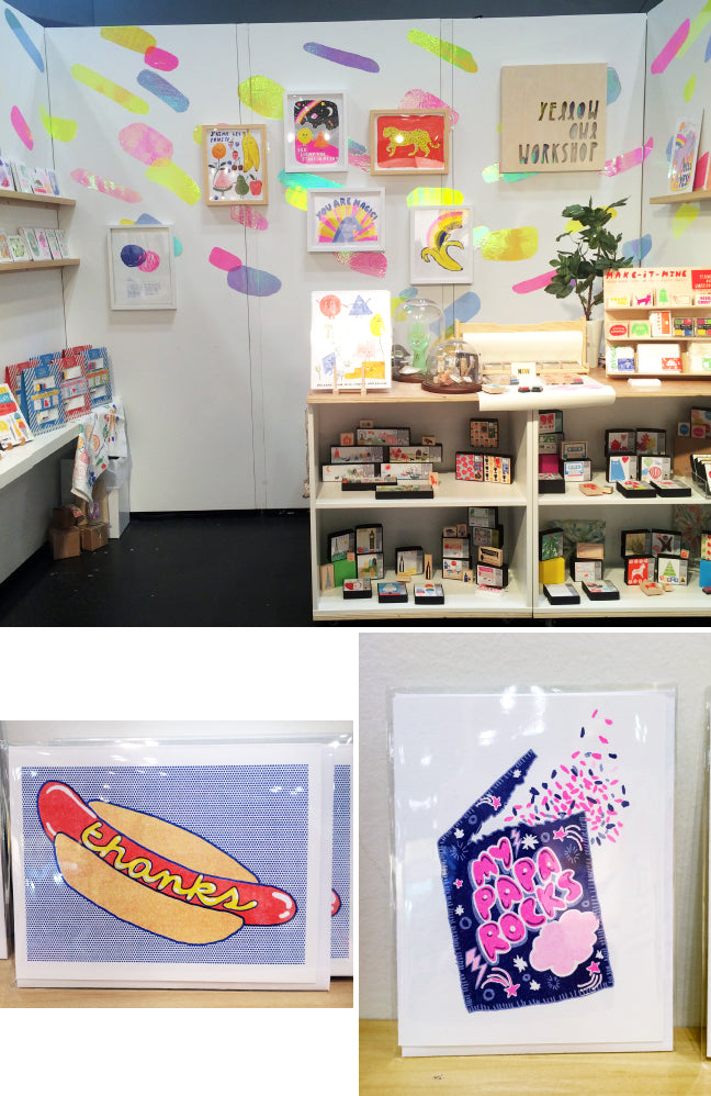 Yellow Owl Workshop’s booth was just as bright and playful as I was expecting! I couldn't pass